About
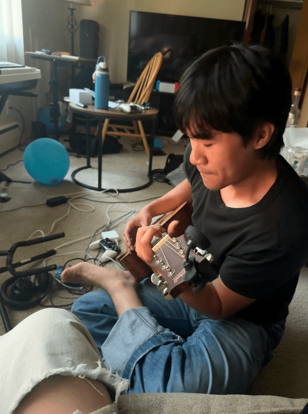
I am pursuing a Bachelor's in Computer Science from Michigan State University. In my free time I like listening to Belle and Sebastian, Jon Brion, and the Beatles. I also like Leonard Cohen's poetry and creative design done my campaign ltd..
I am pursuing a Bachelor's in Computer Science from Michigan State University. In my free time I like listening to Belle and Sebastian, Jon Brion, and the Beatles. I also like Leonard Cohen's poetry and creative design done my campaign ltd..